
Why Family Styling Makes Wedding Photos Look Better
Last Updated on August 25, 2026 by gradienteye
If you are struggling to achieve coordinated family looks, then you are not alone. How often have you found yourself in a situation where the bride and groom’s looks complement each other, but the family looks seem disconnected and disorganized? But more often than not, we fail to understand the importance of family styling.
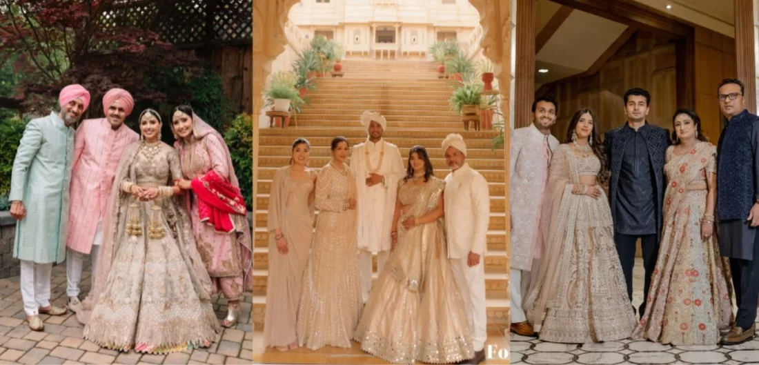
From coordinated colors to other nuances that bring the whole look together, family styling plays a distinct role. Here is a wedding styling guide to help you understand why family coordination enhances the overall look of wedding photos. Here is a portfolio of Lorraine and Akash to explore not only their wedding attire but also what other family members are wearing.
What Family Styling Actually Means
Source: Styl Inc
Coordination, not matching: the difference that changes everything
A coordinated family look plays a crucial role in bringing the whole look together, while complementing the bride and groom’s look. Family outfit coordination at an Indian wedding ensures colors, fabrics and overall aesthetic work well, the entire family looks elegant without appearing identical.
Why is this a color and formality decision, not an outfit-by-outfit one
Family styling for wedding photos starts with choosing a shared color palette and dress code rather than selecting outfits for each family member. This gives a polished and balanced look while allowing each family member to express their individuality.
Who it typically includes: parents, siblings, grandparents, close relatives in key shots
To coordinate family members’ wedding outfits, consider the bride and groom’s parents, siblings, grandparents, and close relatives who are likely to be present at the wedding ceremonies and group photographs.
Why Uncoordinated Outfits Hurt Photos More Than People Realize
Source: Styl Inc
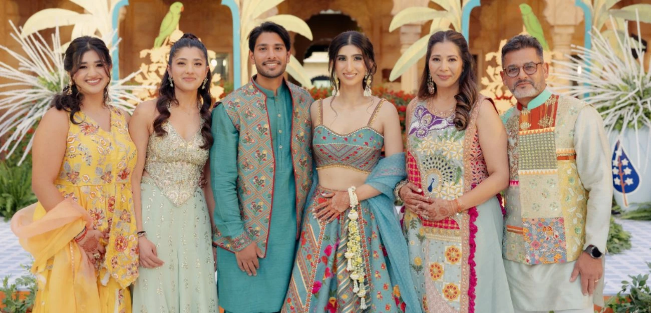
Clashing colors pull the eye away from the couple in every group shot
For an Indian wedding, avoid a family color palette that clashes with one another, as this can divert attention from the couple. A coordinated color palette creates visual harmony, ensuring the couple remains the focal point while making every group photograph look balanced.
Mismatched formality levels make photos look unplanned, even when the venue and decor are perfect
Wearing an outfit that does not complement the vibe of the occasion can create a visual mismatch, whether you are overdressed or underdressed. Dressing according to the occasion and its overall aesthetic, creating a polished and well-coordinated look.
Patterns and prints compete with each other and with the bride’s outfit in the frame
Avoid bold or busy patterns that distract attention from the bride. Instead, opt for subtle patterns and complementary colors that keep the focus on the bride.
How Coordinated Family Styling Actually Improves Photography
Source: Styl Inc
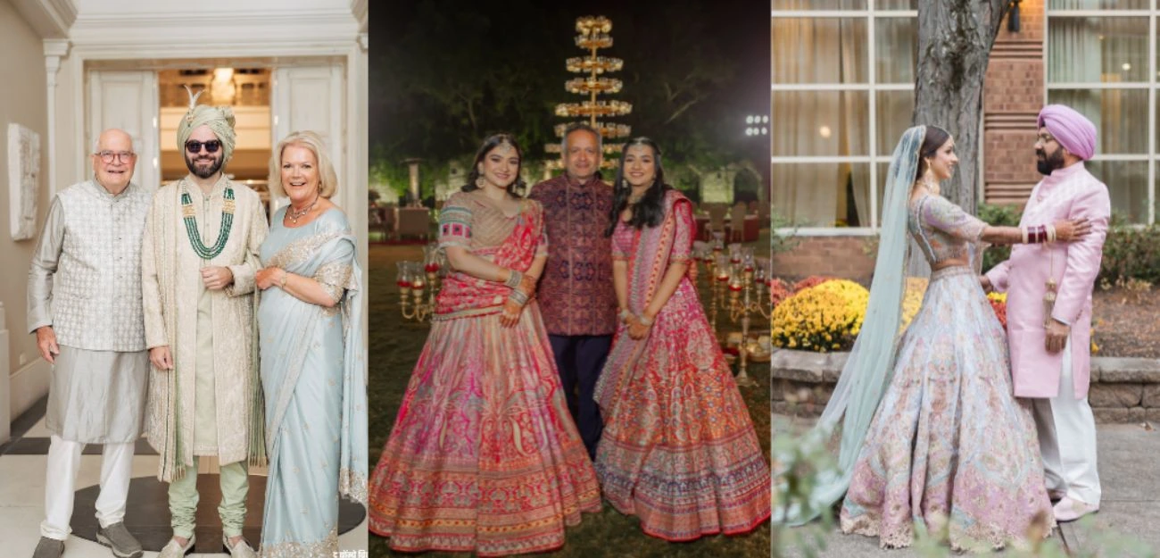
A shared color palette creates visual harmony without anyone losing individuality
To style a bridal party for a wedding, select a color palette that coordinates well to create a polished look. For example, the bride is wearing peach and ivory, the bridesmaids and other family members can opt for sage green, pink and powder blue.
Photos read as intentional and elevated, not accidental
Family photos should look coordinated and polished in photographs rather than randomly dressed. The goal should be to create a cohesive and visually appealing look where each family member’s outfit complements the others.
Coordinated tones help the couple’s outfits stand out rather than blend into the background
When family members choose coordinated tones, it helps the couple’s outfits stand out rather than blend into the background. Understanding the difference between coordinated and matching wedding outfits helps you create a cohesive look without making everyone wear identical outfits.
Group shots and candids both benefit not just the posed portraits
Group shots are important in any wedding to create lasting memories, while candids are unposed, spontaneous moments that may give you giggles years later when you look back at your photos. Posed portraits are worth cherishing and are a must-have for displaying on the wall. These wedding photo styling tips can help capture beautiful memories.
How To Build A Family Color Palette Without Everyone Matching
Source: Styl Inc
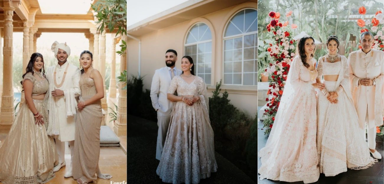
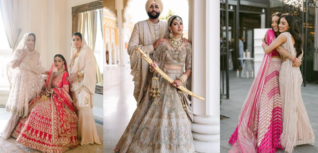
Choosing a palette of 2-3 complementary tones rather than one single color
For family wedding outfit planning, choose a palette of 2-3 complementary colors. For example, if one sibling wears yellow, the other can choose pink. If the mother opts for muted pink, the father can wear fuchsia to create balance and visual harmony without wearing identical colors.
Letting each person choose their own silhouette and outfit within that palette
Choose silhouettes and outfits within a unified color palette. Family members can select different silhouettes and styles while maintaining a cohesive look through coordinated colors.
Using fabric and embellishment level to keep formality consistent across generations
Choose similar fabrics and embellishments to maintain the formality level across generations. If the couple opts for heavy embellishments, other family members can choose more subtle ones, and the same approach applies to fabrics.
Where the bride and groom’s colours should sit in relation to the family palette
The bride and groom should choose a color palette that brings the overall look together. For instance, if the couple wears mint green and ivory, the family members can choose complementary hues to maintain visual harmony without drawing attention away from the couple.
Coordinating Across Functions, Not Just The Wedding Day
Source: Styl Inc
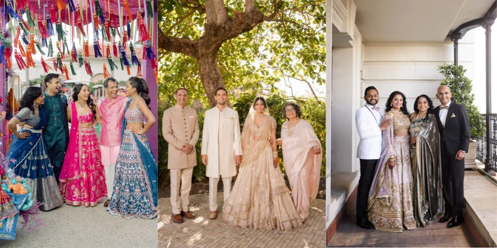
Mehendi: brighter, more playful palette across the family
For family styling by function, experiment with a playful palette for the family. Siblings can opt for orange, while parents can choose green, and grandparents can go for ivory to create a cohesive look.
Main ceremony: a palette built around the bride and groom’s chosen colors
The bridal party can opt for hues that complement the colors chosen by the couple. Family members can opt for complementary or coordinating colors. Avoid wearing red or maroon as it can draw attention from the couple. Opt for subtle and sophisticated colors that capture the vibe of the occasion.
Reception or walima: richer tones, more room for individual statement pieces
If the bride and groom are wearing pastels or rich jewel tones, the family can opt for cohesive colors that align well with the overall color palette while allowing room for individual statement pieces.
Getting buy-in from extended family members without feeling like a mandate
When discussing a wedding with your family, instead of being adamant about decisions, involve every family member and consider everyone’s perspective. This helps everyone feel heard and valued and allows you to reach a decision that resonates with their values.
Managing different budgets across family members within the same palette
To manage the budget across family members, opt for similar fabrics or embellishments while choosing from the same color palette to maintain a harmonious look.
What to do when someone refuses to coordinate
When someone in the family refuses to coordinate, explain the importance of visual harmony and how it can enhance the overall look of family photos.
Timing: when to lock the family palette relative to the couple’s outfit decisions
Choose the family color palette only after the outfits for the bride and groom are decided. This allows the family’s outfits to complement the couple while maintaining a coordinated and cohesive look across the wedding.
Common Mistakes In Family Styling
Source: Styl Inc
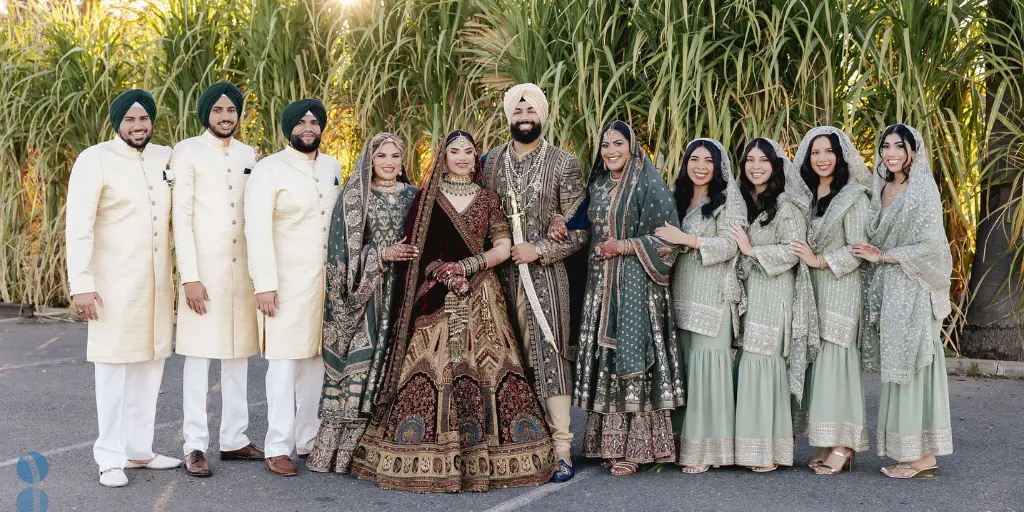
Choosing the palette too late after the outfits are already bought
For family styling, priority should be to choose a color palette first, then select outfits that complement it and create a cohesive, visually harmonious look. Choosing outfits before finalizing the palette can result in a disorganised and disconnected family look.
Forcing exact color matches instead of a coordinated color palette
For a coordinated family look, avoid choosing identical colors, as this can make the outfits look less harmonious. Instead, opt for complementary colors for a balanced appearance.
Ignoring the groom’s side family while overplanning the bride’s side
When planning a color palette or coordinating outfits, the groom’s side is often overlooked. To create a harmonious look, both sides should be given equal importance and thoughtfully coordinated.
Not accounting for how colors will actually look in photos versus in person
Colors can look different in photos due to lighting and camera settings, compared to how they look in reality. This can make colors look brighter or darker than they actually are.
How Styl Inc Plans Family Styling Across Every Function
Styl Inc plans styling for every function with thoughtful consideration. They understand every family member’s needs, silhouettes, and color preferences, and recommend wardrobe choices tailored to their needs.
Conclusion
For family styling, besides coordinating outfits, each family member’s outfit should reflect their individuality. You can use similar fabrics, embroidery, coordinating or complementary colors to create a cohesive look.
Until next time
Keepin’it stylish,
Aparna Iyer
1. Why does family outfit coordination matter for wedding photos?
2. Do all family members need to wear matching colors?
3. How do I build a color palette without forcing everyone to match?
4. When should I plan family outfit coordination relative to my own outfit?
5. How does uncoordinated family styling affect wedding photography?
6. Should the family palette change between mehendi, wedding day and reception?
7. What do I do if a family member refuses to coordinate their attire?
8. How do I coordinate family outfits across different budgets?
9. Should the groom's side be styled the same way as the bride's?
No Comments